Ever wonder what the world looked like in 1700? It wasn’t as simple as pulling up Google Maps! For a glimpse into a potential future, check out this 2025 world map prediction. The maps from that time – some incredibly detailed, others wildly off-base – tell a fascinating story. They show us not only what people thought the world looked like but also how power and politics shaped their understanding. This article explores the world maps of 1700, revealing the surprising differences between them, the reasons for those differences, and the impact of powerful nations on what did – and didn’t – appear on these maps. Get ready for a journey back in time to uncover the secrets hidden within these historical treasures!
Peering into the Past: A Global View from 1700 & its Inherent Limitations
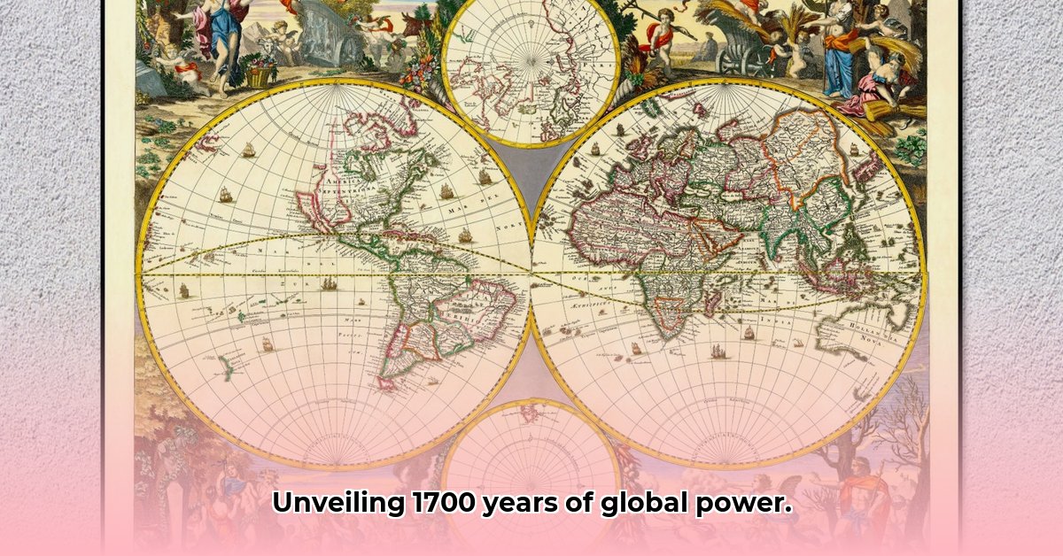
Imagine stepping back in time to 1700. The world was a very different place then, and the maps of that era reflect this reality. World maps from 1700 aren’t just simple pictures of land and sea; they’re historical time capsules, showing us what people thought the world looked like and, more importantly, how they saw it. These maps reveal a fascinating mix of accurate geographical information and significant gaps in knowledge, reflecting the exciting—and often messy—Age of Exploration. They’re like puzzles with some pieces missing, but with significantly more pieces than earlier maps had! Analyzing these maps reveals much about the societal values, technological constraints, and geopolitical ambitions of the time.
Europe’s Powerful Gaze: Examining Geopolitical Biases in Maps
One thing that immediately jumps out when you look at world maps from 1700 is the disproportionate level of detail given to Europe compared to other parts of the world. Europe is shown with remarkable accuracy, reflecting the extensive exploration, surveying, and established trade routes within the continent. However, the rest of the world? Not so much. This difference tells us a lot about the power dynamics of the era. European countries were the dominant players in global exploration and colonization, thus, their maps naturally reflect their priorities and the reach of their expeditions.
Take the Americas, for example. Different maps show wildly different versions of the same continents. California, for instance, is frequently depicted as an island – a rather significant mistake! Similarly, parts of Australia and vast areas of Asia were largely unexplored by Europeans and, as a result, depicted inaccurately or sometimes even omitted altogether. These discrepancies highlight the significant limitations in knowledge and accuracy outside of the European sphere of influence. It wasn’t necessarily that mapmakers were deliberately trying to deceive anyone; they simply lacked comprehensive information. Inaccurate maps inevitably influenced colonial endeavors, impacting territorial claims and resource exploitation.
Mapmaking Matters: How Projections, Politics, and Purpose Shape World Views
It’s not just about the lack of accurate information. The way mapmakers chose to represent the world also reveals a lot about their perspectives and agendas. The choice of map projection itself – the way the spherical Earth is flattened onto a two-dimensional surface – can significantly distort shapes, sizes, and distances. Some projections make certain continents seem larger or smaller than they actually are, subtly influencing how viewers perceive the relative importance of different regions. The Mercator projection, while useful for navigation, notoriously exaggerates the size of landmasses at higher latitudes.
Many maps from 1700 were created to specifically serve the interests of those in power. Political agendas heavily influenced what was included, what was emphasized, and what was left out. For example, a map commissioned by a powerful empire might emphasize the extent of its territorial holdings, even if the boundaries were somewhat hazy or disputed. These maps weren’t solely about charting the land; they were also about asserting power, legitimizing claims, and projecting influence. Considering the patron and their objectives is crucial to understanding a map’s inherent biases. Political tensions between nations profoundly influenced map accuracy and served as a tool for propaganda.
Comparing Perspectives: A Trio of 1700 World Maps & Their Unique Viewpoints
Let’s compare three different examples of 1700 world maps to illustrate differing perspectives. First, consider a map akin to those found on Vividmaps, which provides a high-level overview of the major global empires of the period. It’s a clear political snapshot, showcasing the relative power of different nations and their colonial possessions. Next, consider a resource like OpenHistoricalMap – a crowdsourced project that integrates historical data and cartographic information in a constantly evolving format. This collaborative approach offers a potentially more comprehensive picture but relies on the accuracy and consistency of user-contributed data, which may vary across regions.
Finally, let’s examine detailed maps in the style of Herman Moll, a prominent and prolific mapmaker of the era. Moll’s maps offer an incredible level of detail, reflecting the extent of geographic knowledge available to those with access to resources and information networks. However, keep in mind that even these highly detailed maps reflect the biases and limitations of their time, often prioritizing European perspectives and colonial interests. These maps highlight the gradual accumulation of European knowledge, influenced by the accounts of explorers, traders, and missionaries.
Here’s a quick comparison table highlighting their merits and drawbacks:
Source
Strengths
Weaknesses
Vividmaps-style
Clear political overview; easy to understand; visually appealing
Lacks detailed geographic information; oversimplified; potential for Eurocentric bias
OpenHistoricalMap
Inclusive; continuously updated and evolving; potential for diverse perspectives
Accuracy depends on data quality; may contain inconsistencies and geographic gaps
Potentially biased towards European views and colonial interests; costly to produce
These differences underscore the importance of considering the source and context of any historical map. They weren’t created in a vacuum; they reflect the knowledge, biases, and power dynamics of their time. Modern technologies, such as GIS (Geographic Information Systems) and satellite imagery, enable historians to verify the accuracy of historical maps and identify distortions.
The Legacy of 1700 World Maps: Understanding Maps Beyond Simple Pictures
Understanding the limitations and biases of 1700 world maps helps us better interpret the past and critically assess historical narratives. Historians use these maps, alongside resources like OpenHistoricalMap, to piece together a more complete and nuanced picture of the global landscape, trade networks, and cultural interactions of the era. Educators can leverage these maps to teach about the development of cartography, the evolution of geographic knowledge, and the impact of colonialism. Anyone can explore the fascinating connections between maps and the societies that created them. These aren’t just static images; they’re dynamic tools for understanding history, opening a window into the past that reveals much about the world – and the people – who shaped it. Analyzing historical maps enhances our global understanding by providing insights into past perceptions, biases, and power structures.
How to Identify Biases in 1700 CE World Maps
Key Takeaways:
1700 CE world maps weren’t objective; they reflected the biases of their creators and patrons.
Map projections distorted landmasses, skewing our perception of global power relationships.
Omissions and exaggerations served specific political and economic agendas.
Understanding these biases is crucial for accurate historical interpretation and contextualization.
Analyzing map features, provenance, and intended audience helps reveal underlying assumptions and perspectives.
Decoding the Cartographer’s Perspective: Technological Limitations and Intentional Distortions of Space
Looking at a 1700 CE world map is like peering through a tinted lens. It gives us a glimpse of the past, but the “color” of the glass – the incorporated biases – shapes what we see. Technological limitations played a significant role. Accurately depicting a spherical Earth on a flat surface posed a monumental challenge, resulting in unavoidable distortions. Consider the Mercator projection: it dramatically inflates landmasses at higher latitudes. Greenland appears gargantuan compared to Africa – a gross distortion affecting our understanding of relative sizes and geopolitical importance. But it’s not just about flawed technology; deliberate choices also introduced bias. Were certain regions intentionally minimized or excluded to serve a specific political or economic narrative? Almost certainly. How to identify biases in 1700 CE world maps requires considering both these elements: the inherent limitations of the technology and the deliberate choices made by the mapmaker. Specific mathematical challenges included calculating accurate longitude, measuring the Earth’s circumference, and translating three-dimensional space onto a two-dimensional plane.
A Map Speaks Volumes: Unmasking Power Dynamics Through Cartography
Maps weren’t just geographical representations; they were powerful tools of communication, persuasion, and control. They asserted territorial claims, legitimized colonial power, and projected specific ideologies. The positioning of a nation at the map’s center, for instance, immediately conveyed a sense of dominance and importance. This visual prominence wasn’t accidental; it was a deliberate choice reflecting prevailing power structures and cultural beliefs. Similarly, the level of detail given to a specific region speaks volumes. Highly detailed depictions might represent areas of significant economic or strategic interest, while sparsely detailed areas could reflect a lack of knowledge, limited engagement, or simply disinterest. Mapmakers used visual cues, such as elaborate cartouches and prominent flags, to assert colonial power and underscore territorial claims.
Beyond Size and Placement: The Subtleties of Omission & Geographical Erasure
Hello, My love for writing is rivaled only by my passion for in-depth research. While many may skim the surface, I dive deep, seeking the hidden gems of information that give a story texture and depth. Every word I write is backed by hours of exploration, ensuring that my work is not just compelling, but also meticulously accurate. Join me on a journey where every piece is a deep dive into the realms of knowledge and storytelling.