The Indianapolis flag stands as a testament to the power of design evolution and community engagement. Its journey, marked by an initial misstep and a subsequent triumphant redesign, offers invaluable lessons in civic branding and the significance of a strong visual identity. From a forgotten emblem to a celebrated symbol, the flag’s story reflects the city’s own narrative of growth and transformation.
From Design Flaw to City Symbol: A Journey of Rediscovery
Indianapolis’s first official flag, adopted in 1915, was a complex and cluttered design that failed to resonate with residents. Its intricate details, including a miniature city seal and a confusing array of stars, obscured its intended message. The design’s unintended resemblance to variations of the Confederate flag further compounded its problems, proving to be a significant cultural misstep. This initial failure highlighted a critical lesson: a flag should be simple, memorable, and representative of the community it embodies.
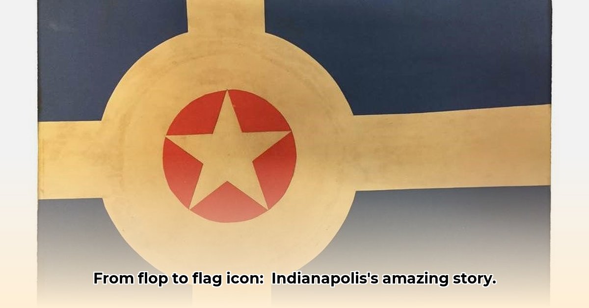
The need for a more effective city symbol became evident, leading to a 1962 design competition. From a pool of 75 submissions, 18-year-old art student Roger Gohl emerged as the winner. His design, a stark contrast to its predecessor, was strikingly simple yet profoundly symbolic. A dark blue field represented the residential areas, a central red circle symbolized Monument Circle, and a single white star within the circle represented the Soldiers and Sailors Monument and Indianapolis’s status as the state capital. Four radiating white stripes symbolized the city’s major thoroughfares and its outward growth. This minimalist design captured the essence of Indianapolis, balancing historical significance with a forward-looking vision.
The Enduring Power of Simplicity and Symbolism
The Indianapolis flag’s success can be attributed to the power of simplicity and effective symbolism. Its clean lines, bold colors, and readily identifiable elements make it instantly recognizable and memorable. The symbolism embedded within the design, rooted in the city’s geography and history, resonates deeply with residents, fostering a sense of civic pride and belonging. The flag’s positive reception by the North American Vexillological Association, scoring an 8.35 out of 10 in a 2004 survey, further validated its design excellence.
Adding a layer of intrigue to the flag’s story is the subtle mystery surrounding its evolution. The version flown today features a centered cross, formed by the intersecting white stripes, while Gohl’s original design had the intersection slightly offset. This undocumented alteration, likely unintentional, sparks questions about the organic evolution of symbols and the unforeseen influences that shape their final form. Despite this subtle change, the flag’s core design elements and symbolic meaning have remained intact, demonstrating the resilience of a well-crafted emblem.
A Modern Emblem: Reflecting Growth and Identity
The Indianapolis flag’s journey reflects the city’s own transformation. From a design failure to a celebrated symbol, the flag’s evolution mirrors Indianapolis’s growth and its emergence as a vibrant cultural hub. The flag’s widespread adoption, appearing on city vehicles, merchandise, and in various public spaces, demonstrates its enduring appeal and its role as a unifying emblem. The flag’s recent resurgence in popularity, fueled by renewed interest in its history and the rediscovery of Gohl’s original design, further solidifies its place in the city’s identity. More than just a visual representation, the Indianapolis flag embodies the city’s spirit, its history, and its aspirations for the future. The flag serves as a reminder that design has the power to shape perception, build community, and transform a simple emblem into a powerful symbol of civic pride.
Hello, My love for writing is rivaled only by my passion for in-depth research. While many may skim the surface, I dive deep, seeking the hidden gems of information that give a story texture and depth. Every word I write is backed by hours of exploration, ensuring that my work is not just compelling, but also meticulously accurate. Join me on a journey where every piece is a deep dive into the realms of knowledge and storytelling.


")
