Ever feel lost in a sea of numbers? Want to quickly identify trends and patterns in your data? Strip charts are your solution. This guide will teach you how to use them effectively, transforming data into actionable intelligence without needing advanced math skills. We’ll cover what strip charts are, when to use them, and how to create them, empowering you to monitor website traffic, machine performance, stock prices, and more.
Visualizing Data Trends with Strip Charts: An Overview
Strip charts offer a straightforward approach to visualizing data changes over time. They represent data points plotted chronologically, forming a visual record of measurement changes. They are perfect for real-time monitoring and anomaly detection, acting as a live dashboard for your data. Spot deviations and react quickly, viewing data in a way that’s immediately understandable. Think of it as a seismograph for your data, constantly recording and highlighting significant events.
Strip Chart Fundamentals: Understanding the Basics
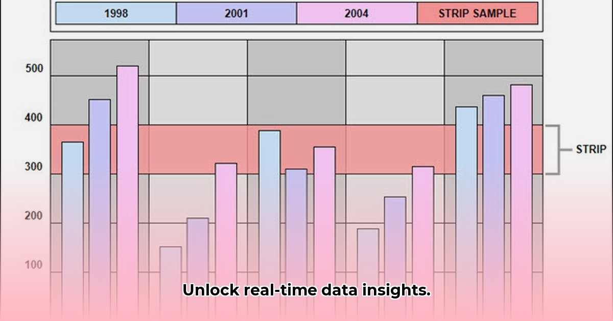
A strip chart, also known as a strip plot or one-dimensional scatter plot, is a visual depiction of data points plotted along a single axis. Typically, the axis represents time, but it can also represent other continuous variables. Each new data point is added sequentially, creating a continuous record of changes in a specific measurement. This continuous nature sets them apart from other charts that show data snapshots at specific moments. Monitoring manufacturing temperatures with a strip chart, for instance, provides a constant view of whether the temperature is within acceptable limits, making them ideal in real-time monitoring situations for immediate response. In essence, it’s like a timeline of your data.
Optimal Use Cases: When to Deploy Strip Charts
Strip charts excel in scenarios requiring continuous monitoring of a limited number of variables, where you need to:
- Track a Single Key Metric: Observe critical system parameters like engine temperature, website uptime, or network traffic with immediate clarity. Spot deviations from the norm instantly.
- Rapid Anomaly Detection: Real-time plotting makes unusual spikes or dips immediately visible, valuable for quality control in manufacturing, detecting fraudulent transactions in finance, or identifying security breaches in IT.
- Visualize Short-Term Trends: Display short-term patterns, ideal for viewing minute-by-minute or hour-by-hour changes, particularly useful in financial markets or high-frequency sensor data.
However, strip charts are less suitable for:
- Analyzing Large Datasets: With datasets containing hundreds or thousands of points, strip charts become cluttered and difficult to read. Histograms, box plots, or violin plots are generally preferred in these situations.
- Complex Relationship Visualization: When you want to understand the relationship between multiple variables (e.g., how marketing spend affects sales), scatter plots or heatmaps are more appropriate.
- Presenting Summary Statistics: Strip charts show individual data points but don’t automatically display summary statistics like the mean, median, or standard deviation.
Choose strip charts when your goal is real-time monitoring of specific variables for immediate insights into temporal trends and anomalies.
Variations: Single, Multiple, and Digital Strip Charts
There are several types of strip charts, each suited to different analytical needs. Single-channel charts track one variable over time, perfect for monitoring a single temperature sensor or network connection. Multi-channel charts simultaneously track multiple variables. For instance, you can monitor temperature and pressure during a chemical reaction for quick correlation analysis. Digital strip charts offer advantages over paper-based versions, including zoom, data export, data overlay options, and integration with analysis software. These provide enhanced analytical capabilities. They are particularly well-suited for environmental monitoring, financial analysis, and industrial process control.
Crafting an Effective Strip Chart: A Step-by-Step Methodology
Creating a strip chart involves:
- Variable Identification: Clearly define what you’re measuring (e.g., CPU usage, pipeline pressure, website visitor count).
- Scale Setting: Determine the appropriate minimum and maximum values for the y-axis to show data clearly. Consider using dynamic scaling to adapt to changing data ranges.
- Sampling Rate Selection: Decide how frequently to collect data. More frequent sampling provides more detail but requires greater resources. The sampling rate should be appropriate for the rate of change of the variable being measured.
- Jittering Implementation: Add random “jitter” to avoid overlapping data points, particularly if data volume is high. This technique spreads the points slightly horizontally, making it easier to see the density of the data.
- Result Interpretation: Analyze the chart for trends, patterns, or anomalies to visualize what’s happening. Look for sudden spikes, gradual increases or decreases, and cyclical patterns.
Advantages and Disadvantages: A Balanced View
| Advantage | Disadvantage |
|---|---|
| Easy to comprehend and interpret | Not ideal for analyzing extensive datasets |
| Ideal for real-time monitoring | Limited analysis capabilities |
| Highlights anomalies and outliers | Can be cluttered with excessive data |
| Simple to create and implement | Requires attention to scale and sampling |
| Preserves individual data points | Lacks automatic calculation of summary statistics |
Strip charts strike a balance between ease of use and actionable data monitoring, making them a preferred tool for initial data exploration and continuous surveillance.
Charting the Future: Advanced Applications
Modern digital strip charts are evolving, integrating with sophisticated data analysis techniques and AI for enhanced anomaly detection and predictive capabilities. Applications include:
- Predictive Maintenance: Continuously monitor key parameters of machinery to predict maintenance needs and prevent downtime, improving efficiency and reducing costs. For example, monitoring vibration levels in a motor can indicate when it needs servicing.
- Real-Time Fraud Detection: Spot patterns associated with fraud in financial transactions, protecting assets and preventing financial losses. This might involve monitoring transaction amounts, locations, and frequencies to identify suspicious activity.
- Process Optimization: Allow real-time adjustments to production processes in manufacturing, enhancing output quality and reducing waste. For example, monitoring temperature and pressure in a reactor can allow for adjustments to maximize yield.
- Cybersecurity Monitoring: Strip charts can be used to monitor network traffic, server load, and other key metrics to detect and respond to cyberattacks in real time.
The applications are expanding as the need for effective real-time data visualization increases, enhancing analytical insights across various sectors.
Choosing Between Jitter and Stacking for Clear Strip Chart Visualizations
Strip charts effectively visualize smaller datasets, emphasizing individual data points. However, data points may overlap, necessitating the use of jittering or stacking, which affects data interpretation. Understanding the nuances of each method is crucial for effective data communication.
Differentiating Jittering and Stacking
- Jittering: Randomly adjusts each data point’s position along the x-axis (or y-axis for vertical strip charts) to prevent overlap, revealing the distribution and density of data. This method helps to visualize the spread of the data and identify clusters.
- Stacking: Vertically stacks data points, highlighting the frequency of specific values, revealing the count of repeated data points. This method is useful for understanding the prevalence of certain values within the dataset.
Selection Framework: Optimizing Display
The optimal method depends on the data and desired communication goals:
- Overlap Assessment: Determine the magnitude of overlap to inform the choice between jitter or stacking. If there’s minimal overlap, neither method may be necessary.
- Visualization Priority?: Choose jittering to highlight individual data points and their distribution or stacking to highlight value frequency and clustering. Consider what aspect of the data is most important to convey.
- Data Density Consideration: High data density might make stacking clearer than jittering, which can still result in visual clumping. With very dense data, consider alternative visualization methods.
- Experimentation and Iteration: Compare jittered and stacked charts to determine which communicates insights most effectively. Different audiences may have different preferences.
- Visual Enhancements: Improve chart clarity using color, shape, and labels, regardless of the method chosen. Highlighting key data points or trends can improve understanding.
Real-World Examples
Consider analyzing customer ratings (1-5 stars):
- Jittering: Shows the distribution of ratings, revealing clusters around specific star values. This can help you see if most customers are giving 4 or 5 stars, or if there’s a wider spread.
- Stacking: Displays the count of each star rating, showing the number of customers who gave each rating. This provides a clear count of how many people selected each rating.
Leveraging R for Visualization
R provides powerful tools like stripchart() and ggplot2 for creating strip charts. ggplot2 offers more control over aesthetics and customization options.
Core Concepts:
- Strip charts are ideal for visualizing smaller datasets and highlighting individual values.
- How to choose between jitter and stacking methods in strip charts for optimal data visualization is crucial for effective data analysis and communication.
- Jittering scatters points to show distribution; stacking groups identical values for frequency display.
- The choice depends on your data and the story you want to tell.
- Experiment to find the most effective visual representation for your dataset and your audience.
Strip Chart Applications in Real-time Industrial Monitoring Systems
Key Points:
- Strip charts simplify continuous data monitoring, ideal for quick identification of deviations and trends, allowing for quick responses to prevent downtimes and maintain operational efficiency.
- Digital strip charts excel in data storage, precision, and